ShopDreamUp AI ArtDreamUp
Deviation Actions


Suggested Deviants


Suggested Collections


You Might Like…


Featured in Groups


Comments98
Join the community to add your comment. Already a deviant? Log In
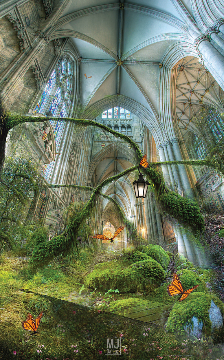
This is a beautiful fantasy piece. I particularly like the soaring architecture that seems to continue on forever. The viewer's eye is led up from the foreground stream, past the golden hallway in the distance, and up to the window near the ceiling. The arching plants echo the arches of the cathedral very well. The images are well centered on the canvas, giving the piece good balance. The off-center placement of the lantern, directly above the light glow in the distance is a nice touch.
The blending is generally well done. However, there is a bit too much transparency to one of the rocks at the base of the column on the right. It looks almost like a ghost image. The bridge does not seem to go anywhere. It just seems to be hanging in mid-space, as it is bounded by rocks at either end. Also, on the right column, where the top of the plant hangs over it, immediately below the plant some branches are visible that do not appear to be part of the plant. Additionally, on the right side, just above and behind your light source glow, a banister railing is visible that has no corresponding stair. I would suggest removing the railing from the stock image.
The color palette is well-chosen and harmonizes well, unifying the entire piece. The only color problem I notice is the large foreground rock on the right, it seems rather too blue for the rest of the work. A little desaturation of color on the exposed rock portion to tone it down would work.
Overall impression - excellent vertical lines, unified perspective, and a very interesting juxtaposition of the natural with the architectural.